Explore Bauhaus Typography at Aspen’s Bayer Center


Tony Prykryl/Courtesy photo
In Aspen, the name Herbert Bayer holds a certain gravitas. Not just because he was one of the most well-known students of the Bauhaus, or his prolific career as a designer and artist, but from the three decades he called this place home, which left an undeniable mark on Aspen.
Bayer moved to Aspen in 1946 by invitation of Chicago Industrialist Walter Paepcke, who wanted him to assist in transforming the town into the living embodiment of a place that nourishes the “Mind, Body and Spirit.”
The Austrian-born designer and artist came armed with his Bauhaus training and philosophy around the importance of minimalism, the marriage of form and function, and the ethos of “total design.” One of his foremost and lasting accomplishments was the building of the 40-acre campus of the Aspen Meadows, which is comprised of the Aspen Institute, Aspen Meadows Resort, Aspen Music Festival and School, and Aspen Center for Physics.
The Resnick Center for Herbert Bayer Studies — a museum, exhibition space, and educational center honoring his work — officially opened to the public on June 26, 2022.
The Bayer Center’s third exhibition, “Bauhaus Typography at 100,” which opened on June 11 and will run until April 25, 2025, explores and celebrates the school’s legacy in graphic design and typography.
A collaboration with San Francisco-based Letterform Archive, the exhibition features work by Johannes Itten, Paul Klee, Wassily Kandinsky, László Moholy-Nagy, Joost Schmidt, and Herbert Bayer along with others whose innovative typographic contributions are often overlooked, including women such as Friedl Dicker.
Letterform Archive first exhibited “Bauhaus Typography at 100,” in 2019 in honor of the 100th anniversary of the Bauhaus and published a corresponding book. The exhibition is structured in a way that each gallery represents a different chapter.
Bauhaus typography emphasized simplicity, functionality, and legibility and moved away from the ornate and decorative letterforms of the past. The movement’s key figures, such as Bayer, created new typographic layouts and fonts, including universal type. These fonts were sans-serif, which was considered more legible than serif fonts.
Though the school only lasted 14 years, it had a tremendous influence on what followed.
“The Bauhaus contributed greatly to the early 20th-century modernization of typography,” Curator and Letterform Archive Executive Director Rob Saunders said. “Some of the key figures in mid-century American graphic design, like Herbert Bayer, started there and brought the Bauhaus ideals with them.”
On Tuesday Saunders joins Bayer Center Executive Director Lissa Ballinger to discuss the new exhibition from 6 to 7 p.m. as part of the Free Public Lecture McCloskey Speaker Series at Paepcke Auditorium.
The exhibition draws a throughline from the Bauhaus’s iconic style to the shape of typography today.
“Late 20th-century graphic designers, especially for corporate branding, found the Bauhaus typographic style very effective, and we still see echoes of it now,” Saunders continued.
Maybe the most recognizable influence of Bauhaus design and typography in more modern times was on Steve Jobs and his approach to designing Apple products and marketing.
In 1983, Jobs gave a talk at the International Design Conference in Aspen, in which he discussed his approach to designing computers which echoed the Bauhaus philosophy when he said, “We have a chance to make these things beautiful, and we have a chance to communicate something through the design of the objects themselves.”
In terms of typography, like the Bauhaus, Apple almost exclusively uses san-serif typefaces, that focus on simplicity and functionality and utilize white space, with clean and crisp lines. Another clear influence is Bayer, who believed capital letters were a waste of time and almost always communicated in lowercase letters, Jobs similarly utilized lowercase letters, I.e., iMac, iPad, and iPhone.
Through books, magazines, course materials, product catalogs, stationary, promotional fliers, and other memorabilia, the “Bauhaus Typography at 100” exhibition details the evolution of typography and design since the early days of the movement.
“It’s a key part of the history of graphic design taught to students today, and its pedagogy broke down barriers in art and design education in a way that is still influential,” Saunders said.
Sarah Girgis is the Publisher for The Aspen Times. She can be reached at 970-429-9151 or sgirgis@aspentimes.com.
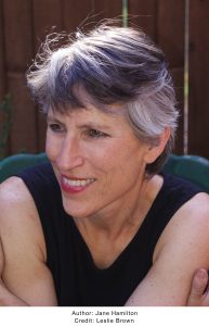
From Oprah’s picks to Aspen’s stage, author Jane Hamilton unveils ‘The Phoebe Variations’
With fall in the air, curling up with an engrossing novel can be the perfect way to embrace the changing season. Acclaimed novelist Jane Hamilton is bringing her highly anticipated latest novel, “The Phoebe Variations,” to the first-ever Aspen Words Literary Festival. Set for release on Sept. 23, the book is already generating buzz, with early reviews calling it “a glorious novel” and “a winner.”


Four Aspen restaurants receive recognition in the 2025 Michelin Guide Colorado
The Michelin Guide Colorado published its 2025 list on Monday, with four Aspen restaurants included in the prestigious lineup.